

This next one is actually 7 photos stitched together. It’s more dramatic, really giving the panoramic feel. And while you can’t fully see the mountains, I really like the effect the clouds bring to the composition. The adjustments in this one are basically the same as the first. I turned up the contrast a little, and also turned up the magenta in the blue channel to make the sky pop more, giving better contrast to the clouds.

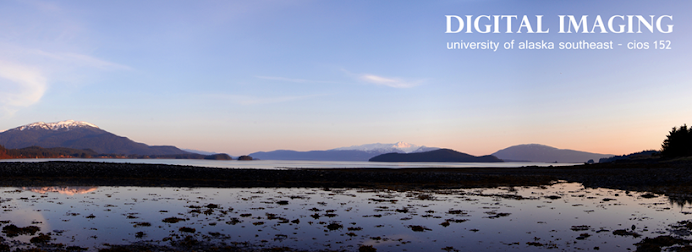
This series I took on a frosty morning before work. It’s 5 photos stitched together. Same techniques and adjustments as the previous one, the only difference being I did adjust levels. While it doesn’t have the brilliant blue sky of, I really like the early morning feel, and the shape of the clouds lit up by the sun. With pictures I’m always trying to capture the feel that I had when I was taking them. I believe I accomplished that with this one. Every morning as I walk to work I always find myself wishing I could share the beauty of this view with others. I’m really excited about this photo stitching technique because it helps to do that, to capture the essence of what I am seeing. I was reading about panorama shots on some website and it was saying that these types of photographs are so effective because they almost match the eye’s natural field of vision. You really get the feeling of being there. I did have some trouble on the left side with the sun in my lense. The little rainbow effect in the rightmost frame I like, but you can also see a lighter vertical stripe to the left of that. I wasn't able to correct it without losing what I felt was too much of the remaing detail. If anyone has suggestions that would be appreaciated. Or maybe it waorks that way I'm not sure.

So I did one more cause I was on a roll and getting the technique down pretty well. This one was more of a challenge because of the tripod-in-snow issue I mention earlier. The pictures on the right side especially (I think this one was 6 total) were really crooked, and required a lot of adjusting/lining up to fix. I made the canvas extra tall and stitched them together that way (it ended up at a diagonal.) Then, when I had that done I flattened the image and Transform-Rotated the whole thing before cropping. I had tried straightening each one individually as I had done on the previous ones but they were just too crooked, it was giving me problems. I think this way is faster and more accurate.

With text

All of these images I created at 300 dpi with the hope of getting poster prints of them done. For the uploaded files reduced them to 72 dpi and then reduced that image by 20%. This was a great project and I plan to do many more panorama compositions.


.jpg)


No comments:
Post a Comment