Monday, April 27, 2009

Photoshop Tutorial: Using the Levels and Selective Color Tools

This tutorial will demonstrate how to use the Levels and Selective Color tools to add contrast and color to an image. 

Before Adjustments
My goal was to increase the warmth in the above image to enhance the colors of the sunset that were already there. I also added contrast to the image to make the composition more dramatic. I accomplished this with a combination of the Levels and Selective Color tools. Below are written instructions for the settings that I used.

After Adjustments

This information is intended as a supplement to the video tutorial that you can watch here. I recommend that you watch the video first.

Here are the steps I took to achieve this result:

Image --> Adjustments --> Levels  (or Ctrl + L)

The Levels tool lets you adjust the shadows (blacks)  midtones (grays) and higlights (whites) of an image along its histogram. You can adjust the red, green, and blue all at once on the RGB channel (good for adjusting contrast and brightness) or each of these colors independently on their repective channel. 

Adjusting the midtones on individual color channels can add color to an image in a way similar to adjusting tint.  Here are the Levels settings that I used to enhance the contrast and colors of the sunset:

RGB Channel: Shadows - 15, Midtones - 74 (Increased contrast)

Green Channel: Midtones - 91 (Added Red)

Blue Channel: Midtones - 82 (Added yellow/orange)

Red Channel: Midtones - 1.02, Highlights 249 (Added red/pink to highlights in clouds)

Image--> Adjustments --> Selective Color 

The Selective Color tool lets you make adjustments to individual colors in your image by changing their levels of cyan, magenta, yellow, and black. Below are the settings I used to adjust the blues in the sky for my image.

Colors: Blues - Magenta +17, Yellow +19, Black + 50

Additional Notes

Although Levels can be used on any image, it should be done with care. Adjusting Levels on the RGB channel can be a good way to add contrast and highlights to an image. I encourage you to experiment with this tool to get a feel for its abilities. Always make a duplicate later or duplicate image of the file you are working with to prevent uninteded permanent changes. 

Adjusting levels on single color channels should only be used to correct a color cast or if you intentionally want to add colors to an image.

Learning keyboard shortcuts is an important part of learning to use Photoshop and will greatly increase your efficiency. Below I have included the ones used in this tutorial.

Keyboard shortcuts for commands used:

Levels ----------------------------> Ctrl + L
Hide Tool Bar and palettes --------> Tab
Switch between open files ---------> Ctrl + Tab
Fit image to screen ----------------> Ctrl + 0 (zero)

If you have any questions or comments please feel free to email me at joeltmundy@yahoo.com

Sunday, April 19, 2009

Project 7: Layer Masks

This project was a little more technical than the past few and I ended up learning a lot.

Original Photo

I used the same photo for all three compositions in this project to emphasize the differences between the techniques used in each. This photo is of Presley, one of our family dogs, and was shot by my brother James in Anchorage.

Composition 1: Adjustment Layers and Layer Masks


My goal for the first project was to give depth to this picture. I did this by increasing the detail of the foreground image, while decreasing the detail of the background. To accomplish these adjustments to different areas of the picture I used a layer mask. 

First I created a new adjustment layer and adjusted curves.  Next I added a layer mask to the curves layer. I then created a new layer above the curves layer, filled it with white, and turned the opacity down to about 75% to reveal the foreground image underneath it.  Going back to the layer mask, I painted around the foreground image in black to create a mask that would block out the curves adjustment for the background while fully showing the foreground image.

Occasionally I got mixed up about which layer I was supposed to be painting on, as you can see in the video, but in the end I figured it out without too much trouble. So then I had a layer mask that effectively isolated the background from the foreground, allowing me to make changes to each independently. I applied a watercolor filter to the background layer and made adjustments with shadows and highlights to increase the detail of the foreground image. Last I changed the opacity back to 100% on the topmost layer and experimented with different gradient map effects; finally settling on a bronze color that I felt best accented the colors in the foreground image. I was torn between the bronze and a higher contrast black background, but in the end I went with the bronze. I recorded the whole process and set playback to 300% speed. You can watch it here, feedback welcome. 

Composition 2: Using a Layer Mask as a Stencil

For the second composition I used a layer mask to create a stencil effect. I created a tonal map by using selections of shadows and midtones from Select - Color Range. I then used the Fill command to fill the midtone selections with 50% gray and the shadows with 100% black. I merged these two layers to create the tonal map. Next I created a new layer that I filled with a white background, making sure to turn off preserve transparency. I then added a layer mask to that layer and copied the tonal map onto the  layer mask (selecting it by holding down the alt key) and inverted the image. Next, I moved from the layer mask to the layer thumbnail and painted with the brush to reveal the stenciled image. I recorded this process and you can watch it here. 

Composition 3: Creating a Textured Type Effect with a Layer Mask

For the textured type composition I created a tonal map and a new layer and layer mask through the same process as in composition 2. Then I copied text from a word document onto the new layer, creating a text layer. Next I copied the tonal map onto the layer mask and inverted the image. Combining the text and tonal map mask created a nice textured effect. I thought the effect would be improved by adding emphasis to the foreground image so I copied it (with only a little trouble as you can see in the video) into a version of composition one to use the background mask I had created there. I then applied a black and white gradient map to the background to unify and add emphasis to the black and white foreground image. 

By this point I felt fairly comfortable with the layer mask process as well as the associated keyboard/mouse shortcuts. The creation of the third composition went significantly smoother that the first and is my favorite of the three. That’s always a good indicator of progress for me.  I recorded the process and you can watch it here, feedback welcome.

I feel like I am just getting started with layer masks and have made some good initial progress. This assignment really helped me to get the basics down. Developing it will take some practice like everything else in PS. If you have time to check out the videos I posted to YouTube I think they are an effective way to share our experiences. The one John posted definitely helped me to better understand these concepts. 

Monday, April 6, 2009

Project 6: Photo Stitching


I ended up really enjoying this project, so I did several different panoramas of the same subject. They were shot on several different days, with varying exposures and weather conditions. I’ll start with my main submission.

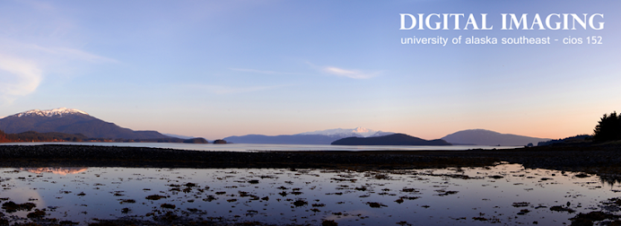
I considered different subjects for the photo stitch project. In the end, my love of landscape and nature shots, combined with our first sunny days in long while made the decision for me. I shot these behind the university with a tripod, standing in snow up to my knees. The final product is 5 different photos stitched together. I mention the snow up to my knees to emphasize the trouble I had getting the tripod level. I ended up with a ‘curving’ effect as I rotated the camera. I used the Transform-Rotate tool to straighten the crooked ones out and line up the different pictures. Next I used the eraser with the opacity at about 60% to blend the photos together. The colors/exposures matched pretty well so I didn’t even need to adjust Levels. I did adjust Brightness/Contrast, turning them both up a little. Other than that I left it as is. For the text I wanted something that similar to the graphics standards of UAS, the idea being that they could use it on this photo on their website or in university publications. The font is Alte Haas Grotesk which I got off of dafont.com. I felt that a white color for the font was the best choice, and the only color that would match the feeling of the picture. I decided to put it up top so it would contrast well against the blue of the sky. I used the grid to center and position it.  

Original Stitch

With Text Added

This next one is actually 7 photos stitched together. It’s more dramatic, really giving the panoramic feel. And while you can’t fully see the mountains, I really like the effect the clouds bring to the composition. The adjustments in this one are basically the same as the first. I turned up the contrast a little, and also turned up the magenta in the blue channel to make the sky pop more, giving better contrast to the clouds.

This series I took on a frosty morning before work. It’s 5 photos stitched together. Same techniques and adjustments as the previous one, the only difference being I did adjust levels. While it doesn’t have the brilliant blue sky of, I really like the early morning feel, and the shape of the clouds lit up by the sun. With pictures I’m always trying to capture the feel that I had when I was taking them. I believe I accomplished that with this one. Every morning as I walk to work I always find myself wishing I could share the beauty of this view with others. I’m really excited about this photo stitching technique because it helps to do that, to capture the essence of what I am seeing. I was reading about panorama shots on some website and it was saying that these types of photographs are so effective because they almost match the eye’s natural field of vision. You really get the feeling of being there. I did have some trouble on the left side with the sun in my lense. The little rainbow effect in the rightmost frame I like, but you can also see a lighter vertical stripe to the left of that. I wasn't able to correct it without losing what I felt was too much of the remaing detail. If anyone has suggestions that would be appreaciated. Or maybe it waorks that way I'm not sure.


So I did one more cause I was on a roll and getting the technique down pretty well. This one was more of a challenge because of the tripod-in-snow issue I mention earlier. The pictures on the right side especially (I think this one was 6 total) were really crooked, and required a lot of adjusting/lining up to fix.  I made the canvas extra tall and stitched them together that way (it ended up at a diagonal.) Then, when I had that done I flattened the image and Transform-Rotated the whole thing before cropping.  I had tried straightening each one individually as I had done on the previous ones but they were just too crooked, it was giving me problems. I think this way is faster and more accurate.


With text

All of these images I created at 300 dpi with the hope of getting poster prints of them done. For the uploaded files reduced them to 72 dpi and then reduced that image by 20%. This was a great project and I plan to do many more panorama compositions.