I took this photo at school a couple weeks ago. Before I knew PS, I would have chucked it into the burn pile. For the filters project, I decided to bring it back from the dead, and use some filters in process. My goal was to make this picture look like what I saw when I was taking it. In other words, how I imagined the picture would look when I took it. Here's a general outline of what I did.
Camera Raw
Raised temperature a little
Adjusted exposure
Adjusted brightness and contrast
Photoshop
Levels - Raised low and mid levels
Applied Smart Sharpen Filter - Remove: Lens Blur Amt. 200% Radius: 2 pixels
Faded Smart Sharpen Filter: Luminosity
Adjustments: Selective Color - adjusted reds, greens.
Adjustments: Selective Color - neutrals - raised yellow (with only totem pole selected)
Hue/Saturation Adjustments
Applied Ink Outlines Filter
Hue/Saturation Adjustments
I was able to sort the colors out fairly easily; I feel like I'm getting better at that. The main trouble I had in this photo was contrast. The original is washed out and flat. I turned up contrast in adjustments but it wasn’t enough. The other problem I had was all the white snow. I needed a way to get contrast and definition around the edges of the snow, and to make the totem pole stand out from the background. The Smart Sharpen filter helped with this but it wasn’t enough. I wanted the final image to be a bit stylized and to crank up the contrast at the same time. To accomplish this I ended up using the Ink Outlines filter. It added the contrast I needed and lightly outlined the snow areas, plus gave the totem the look I was going for. This end result (rightmost picture) is very close to how I imagined the shot when I took it.
One problem I ran into was losing some details of the Ink Outlines Filter when I reduced the image for the web. (I changed it from 300 dpi to 72.) I ended up going back and reducing the image without changing dpi. Hopefully the conversion that takes place during upload will be more kind. Be sure to click on the image to enlarge it and get the full view. Added note: alas the details didn't quite come through after the upload. I still think the results/improvements are visible enough. On a widescreen you can view all 3 at once. Non=widscreeners will have to scroll, apologies.
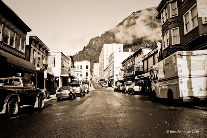
From left:
1. Original Photo 2. Smart Sharpen Filter 3. Smart Sharpen + Ink Outlines Filter
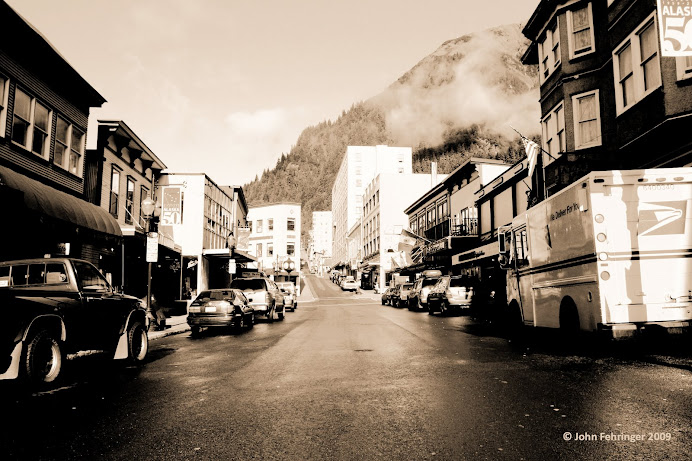
Here's a before and after to compare the original and final side by side:


.jpg)