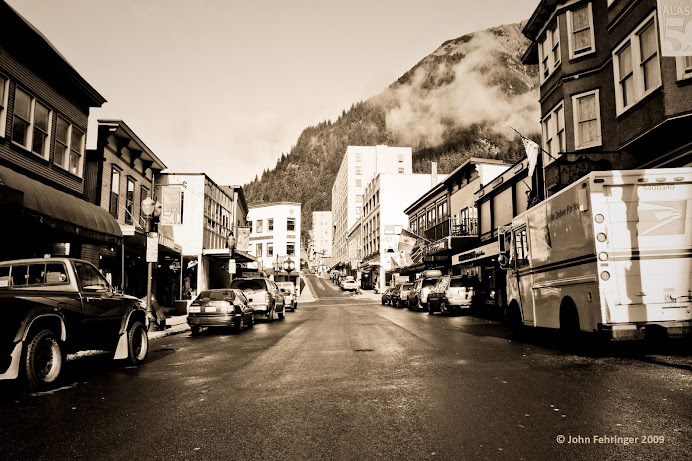
Adjustments
The first thing I tried was Gradients Map, probably because it was my favorite thing in the book so far. But also because I thought it would work, which it did fairly well. The source photo looked like sepia to me so I went straight for Sepiatone in the ‘A dozen gradients’ file. (Quadtone supreme also matched but had too much blue in it.) It was a good match but I made some adjustments.
Sepiatone had too much beige, so I moved the middle color stop to the left from 47 to 40. Then I wanted to get rid of most of the pink tones. There is some pink in the picture I was trying to match but not much. After experimenting a little I moved the pink color stop all the way to the right to 99 and actually moved the white color stop below it to 93. This took the pink out (too much) but I felt it was about as close as I would get with this gradient. Lastly, to match the contrast: the shadows weren’t dark enough so I pulled the black color stop to the right to about 10. I used many reference points, but the shadow on the back of the mail truck was the best one. The result is posted as ‘My Sepiatone.’
I was going to be done with gradient maps at this point but I figured out something by accident, a couple things really. If you double click a color stop it will bring up a window where you can select its color. So again I applied the Sepiatone gradients map (which has 4 color stops) and then I moved the cursor over the target picture and pulled the 4 colors from it with the eye dropper tool. I pulled the black color stop to 8 or 9 and upped contrast to +36 in Hue/Contrast. The result is what I have posted as ‘My Version’.
I also tried converting the image to black and white, selecting ‘Colorize,’ and then adjusting Hue/Saturation with some success. At this point though I’m honestly not sure how the source photo was done. It has shadows and contrast that I am lacking in mine, and the colors aren’t quite the same.
Tips/Tricks: In Gradient Maps you can change the color of color stops by double clicking on them. If you’re trying to match the colors of another picture, you can move the cursor over the source picture and pull colors from it with the eyedropper.
Color
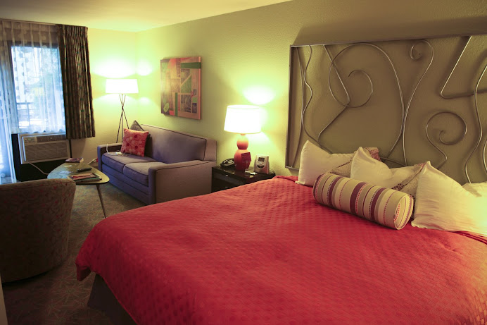
This picture had an orange color cast. I tried a lot of different things with varying results. My best result to match the source photo came from using a combination of Camera Raw and Color Balance. Looking at the histogram I knew there was almost no blue and too much red, so most of my adjustments were focused on that. Throughout the process I compared the histograms to keep me going in the right direction. I have mine set to all channels view, and show channels in color.
One of the main problems I had was getting blue into the windows and the sofa. I tried adjusting hue/saturation on the blue channel but it had little effect because there wasn’t much blue in my version at first. I finally corrected this using Color Balance.
The first adjustment I tried was Auto Color. It took out some orange but not much. The orange cast was gone but the comforter still looked orange and everything else looked yellow. I also tried Auto Levels and Levels without much success.
I tried Variations too. I moved the Fine/Coarse slider to the left one notch. I focused on adding blue and subtracting red. I clicked the more blue 3 times, the more cyan 3 times, and the more green once. This successfully got rid of the orange cast but left me with a drab picture. I suppose Hue/Saturation may have corrected this but I don’t know because I moved on to Camera Raw…
I am really amazed by Camera Raw (the Heal tool is awesome!). This was the first time I had used it and it was by far the easiest way for me to correct the color cast. Just lowering the temperature to the -50s took the orange out. I adjusted the tint slightly and set recovery at 20. Then from the HSL/Grayscale panel I increased the red hues to -9 (anything over that I lost detail, but that’s what made the red pop) and lowered the orange to +40s.
Then I opened the Camera Raw edited version in Photoshop and opened Color Balance. I removed red to -18, removed green to -32, and added blue to +41. This got me a result I was pretty happy with and it’s the one I have posted as ‘My Version.’
I noticed the copyright logo was a good point to watch when adjusting colors. In the original picture it’s bright orange. In John’s version it’s a light yellow. The closest match I got is good but doesn’t have enough yellow in it. If you look at the logo in mine it’s a light red, almost pink. If you look at John’s it’s a light yellow… His also has more contrast and deeper shadows. I noticed this in the ‘adjustments’ photo too so that’s something I need to learn/work on.
I did some work on the RAW file we got and while the reds aren’t quite as dramatic, I like the detail it brought out in the comforter. Here’s what I didWorking with the Raw file :
In Camera Raw
Temp -60, Tint -21, Recovery 9, Brightness +25, Vibrance +43, Saturation -2, Reds -1, Oranges +
In Photoshop:
Color Balance (Midtones) -2 -11 +11
Hue/Saturation: Red channel +5 Saturation -6, Brightness/Contrast: contrast +8
Selective Color: Cyan +37% Black +10%
This one is posted as ‘My CRaw Version.’
Tips/Tricks: In Camera Raw if you change the image quality to 16 bit (as the book suggests) Photoshop won’t let you save those files as JPEGs. You have to go to Image à Mode and change it back to 8 bit to do that. This is especially important when you’re trying to post to Blogger…


.jpg)


No comments:
Post a Comment