Saturday, February 28, 2009

Project 4: Zac Tile

Getting Started

After opening the Zac Tile file, I doubled the size of my canvas and selected around the outline with the rectangular marquee tool. I then cloned and moved the selection with Ctrl + Alt + Shift and flipped it horizontal with the Free Transform command.  Then I selected the black outlines by loading the channel as a selection (wish I had known that for the last project) and made them a new layer. At this point I made about 10 duplicate images and started experimenting.

Compositions

The first thing I tried with the brush tool was Color Dynamics because it was my favorite from the book assignment.  I tried a variety of diameter, hardness, shape dynamic, and color dynamic settings. I ended up using a brush diameter of 46 pixels with Hue jitter- 92% and  Saturation jitter – 46%. I got the best multicolored effect with red selected for brush color.

For the composition with the white background I moved the brush quickly across the lines to get a thin striped effect.


For the composition with the black background I moved the brush more slowly and single clicked each circle in the frame to get one color per circle.  For the background I left the color dynamic settings active and switched to black.  I then changed to the background layer and filled it in.  This increased the contrast of the colored lines and added texture to the background.


For the fully colored composition, I added the color fill layer and used the custom colors loaded from the file that came with the book. I used the paintbucket tool set to ‘all layers’ with tolerance set to 100, to assure coverage in the corners and other small areas.  In the end I only had to zoom in and fill a few pixels it had missed. I used as many colors as possible (sticking to my multicolored theme) but left the inside of the frame white to contrast the colored circles within it. At the end this picture felt a little flat and I wanted to add some depth.  I experimented with different filters until I found the ‘plastic wrap’ one. It gave me the effect I was looking for, almost like plastic blocks were put together to make the lions face.


Layer Trouble

At some point I messed up the layers so that any green color I selected showed as dark green. I never did figure out why, but it went away once I flattened the image which is why I assume it was related to layers. That wasn’t the only layer related problem I had.  I wanted to make a layer to separate the frame from the face.  I selected the frame, copied it, and went to Layer -- > New -- > Layer via copy.  It created the layer but when I went to paint on it, the paint showed up in the thumbnail but not on my image.  Maybe I should have created a New fill layer? Or maybe it was the layer hierarchy I had wrong.  Not sure.


Friday, February 13, 2009

Project 3: Making Selections

Project 3: Selection Mania

I used the rectangular marquee tool to make four large rectangles while holding the shift key. Then I removed parts of them with the single row marquee tool while holding the alt key to form the squares and to make the shapes more even. I made the triangles with the polygonal lasso tool. This took me a few tries but I got it eventually.

For the circle in the center the biggest help was the ‘spacebar’ trick he taught us in the book, which lets you pause and move the selection. I was having a hard time centering it before I learned that.

Project 3: Dance1

This was a good introduction to doing selections and many other Photoshop tools.

To make my selections for this project I ended up zooming in and using the magnetic lasso tool. Of all the selection tools I tried from the book, this was the one I could get the most accuracy with. I tried the quick selection tool first, but it always ended up leaving out small sections of the face. I tried adjusting the brush diameter and hardness to correct this like we learned with the giraffe from the textbook but didn’t have much luck.

To resize the head I went to Edit – Free Transform. One of the cool things I discovered here was, since these were profile shots, I could change which way the head was facing to match the target picture. The photo I used for the selection was actually taken with me facing the opposite direction

Then Image --> Adjustments --> Black & White. I then used Brightness/Contrast to match my head more closely to the source photo. Mostly I upped the brightness.

Our heads were shaped differently so there were parts of the old head sticking out. I used the clone stamp tool to get rid of those. At first I couldn’t figure out how to use the clone stamp tool so I opened the picture in Camera Raw and used the heal tool which worked OK. But once I figured it out the clone stamp tool worked the best.

To get my neck to appear as if it was inside the collar and bowtie I created another layer from a selection of the bowtie.

One problem I had was a slight halo of white around my head which appeared when I changed the Brightness and contrast settings. I tried to adjust the Blending option to correct this but got a little lost. Everything seemed too drastic a change. This is something I need to work on more but overall I’m happy with the results.

Project 3: Dance2

For this one I used the same techniques detailed in dance1 with one big difference. The white shutters behind the dancers were problematic. The clone stamp solution from the previous picture wasn’t going to work for this one. So I zoomed in around the head and used the rectangular marquee tool to make selections of the shutters which I copy/pasted over the head. When I got too many layers I flattened the image and repeated the process. This took some practice and at first I got confused with the different layers but I figured it out eventually.

I then used the magnetic lasso to select the head in different photo of myself. I used refine edge and adjusted the contrast to 20 and Feather to 1.0. Refine edge is a step I missed on the Dance1 photo. I realize now it could have removed the small white halo. At that point though I had already flattened the dance1 image and was happy with how it looked, but it’s something to remember for next time. I also used Edit --> Transform --> Rotate to angle my head so that I was better facing the other dancer. I selected and created a separate layer for the collar/necktie and positioned it. Brightness/contrast to match the source picture, flattened it and I was done. I think it came out better than the first one but I’m happy with both of them.

Conclusion

The selection mania was a good way to start to get familiar with the selection tools. Both of the dancer projects got me a lot more familiar with Photoshop. I was experimenting and looking through all the lists to find tools that would work.

I also learned that there is a hierarchy to the layers palette that determines which layers appear in front of, or on top of each other. This seems fairly obvious now that I know it but took me some time to figure out.

The 'Drawing Precise Curves' section of the book lost me about halfway through. I've been over it twice now and can't get it to do what it's suppose to. I get the path drawn around the pelican's beak (after about 4 trys), but when when it gets to the copying paths between layers part, I can't get that to work.

Sunday, February 1, 2009

Project 2 Color and Adjustment: Notes

Adjustments

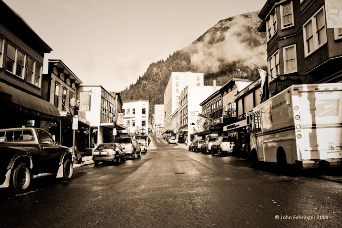
The first thing I tried was Gradients Map, probably because it was my favorite thing in the book so far.  But also because I thought it would work, which it did fairly well.   The source photo looked like sepia to me so I went straight for Sepiatone in the ‘A dozen gradients’ file.  (Quadtone supreme also matched but had too much blue in it.) It was a good match but I made some adjustments.  

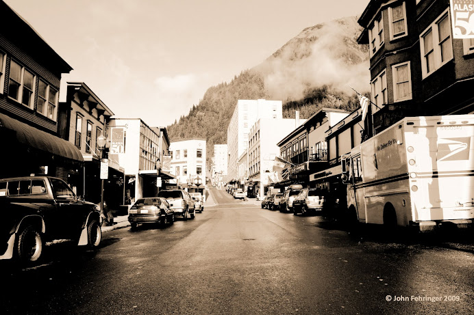
Sepiatone had too much beige, so I moved the middle color stop to the left from 47 to 40.  Then I wanted to get rid of most of the pink tones.  There is some pink in the picture I was trying to match but not much.  After experimenting a little I moved the pink color stop all the way to the right to 99 and actually moved the white color stop below it to 93.  This took the pink out (too much) but I felt it was about as close as I would get with this gradient.  Lastly, to match the contrast: the shadows weren’t dark enough so I pulled the black color stop to the right to about 10.  I used many reference points, but the shadow on the back of the mail truck was the best one.  The result is posted as ‘My Sepiatone.’

I was going to be done with gradient maps at this point but I figured out something by accident, a couple things really.   If you double click a color stop it will bring up a window where you can select its color.  So again I applied the Sepiatone gradients map (which has 4 color stops) and then I moved the cursor over the target picture and pulled the 4 colors from it with the eye dropper tool.   I pulled the black color stop to 8 or 9 and upped contrast to +36 in Hue/Contrast. The result is what I have posted as ‘My Version’.

I also tried converting the image to black and white, selecting ‘Colorize,’ and then adjusting Hue/Saturation with some success.   At this point though I’m honestly not sure how the source photo was done.   It has shadows and contrast that I am lacking in mine, and the colors aren’t quite the same.

Tips/Tricks: In Gradient Maps you can change the color of color stops by double clicking on them.  If you’re trying to match the colors of another picture, you can move the cursor over the source picture and pull colors from it with the eyedropper.

Color

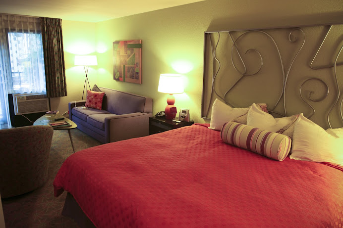
This picture had an orange color cast. I tried a lot of different things with varying results.  My best result to match the source photo came from using a combination of Camera Raw and Color Balance.    Looking at the histogram I knew there was almost no blue and too much red, so most of my adjustments were focused on that.   Throughout the process I compared the histograms to keep me going in the right direction.   I have mine set to all channels view, and show channels in color. 

One of the main problems I had was getting blue into the windows and the sofa. I tried adjusting hue/saturation on the blue channel but it had little effect because there wasn’t much blue in my version at first.  I finally corrected this using Color Balance.

The first adjustment I tried was Auto Color.  It took out some orange but not much.  The orange cast was gone but the comforter still looked orange and everything else looked yellow.  I also tried Auto Levels and Levels without much success.

I tried Variations too.  I moved the Fine/Coarse slider to the left one notch.  I focused on adding blue and subtracting red.  I clicked the more blue 3 times, the more cyan 3 times, and the more green once.  This successfully got rid of the orange cast but left me with a drab picture.  I suppose Hue/Saturation may have corrected this but I don’t know because I moved on to Camera Raw…

I am really amazed by Camera Raw (the Heal tool is awesome!).  This was the first time I had used it and it was by far the easiest way for me to correct the color cast.  Just lowering the temperature to the -50s took the orange out.  I adjusted the tint slightly and set recovery at 20.  Then from the HSL/Grayscale panel I increased the red hues to -9 (anything over that I lost detail, but that’s what made the red pop) and lowered the orange to +40s. 

Then I opened the Camera Raw edited version in Photoshop and opened Color Balance.  I removed red to -18, removed green to -32, and added blue to +41.  This got me a result I was pretty happy with and it’s the one I have posted as ‘My Version.’

I noticed the copyright logo was a good point to watch when adjusting colors.  In the original picture it’s bright orange.  In John’s version it’s a light yellow.  The closest match I got is good but doesn’t have enough yellow in it.  If you look at the logo in mine it’s a light red, almost pink.  If you look at John’s it’s a light yellow… His also has more contrast and deeper shadows.  I noticed this in the ‘adjustments’ photo too so that’s something I need to learn/work on.

I did some work on the RAW file we got and while the reds aren’t quite as dramatic, I like the detail it brought out in the comforter.  Here’s what I didWorking with the Raw file : 

In Camera Raw

Temp -60, Tint -21, Recovery 9, Brightness +25,  Vibrance +43,  Saturation -2,  Reds -1,  Oranges +

In Photoshop:

Color Balance (Midtones) -2 -11 +11

Hue/Saturation:  Red channel +5  Saturation -6,  Brightness/Contrast: contrast +8

Selective Color:  Cyan +37% Black +10%

This one is posted as ‘My CRaw Version.’

Tips/Tricks: In Camera Raw if you change the image quality to 16 bit (as the book suggests) Photoshop won’t let you save those files as JPEGs.  You have to go to Image  à Mode and change it back to 8 bit to do that.  This is especially important when you’re trying to post to Blogger…